
How to Pick Wall Art Colors That Complement Neutral Interiors
Neutral interiors—featuring tones like white, beige, grey, and soft earth hues—have become a cornerstone of modern home design. They create calm, clean, and timeless spaces. However, decorating within a neutral palette can feel challenging, especially when it comes to choosing wall art.
The right wall art can elevate a neutral room, adding depth, warmth, and personality. The wrong choice can make the space feel flat, disconnected, or overly plain.
Choosing wall art colors for neutral interiors is not about adding random color—it’s about introducing intentional contrast, harmony, and balance.
Below is a complete guide to selecting wall art colors that complement neutral spaces beautifully.
1. Understand the Undertones of Your Neutral Space
Not all neutrals are the same. Some have warm undertones, while others are cool.
Understanding this is the first step to choosing the right wall art.
- Warm neutrals: beige, cream, tan → pair well with warm tones like rust, gold, and terracotta
- Cool neutrals: grey, white with blue undertones → pair well with blues, greens, and monochrome palettes
Matching undertones ensures the artwork feels cohesive rather than out of place.
Smard Art collections often incorporate both warm and cool palettes, making it easier to find pieces that align with your space.
2. Use Contrast to Add Depth
Neutral rooms can sometimes feel flat if everything blends together.
Wall art introduces contrast, which adds dimension and visual interest.
Examples include:
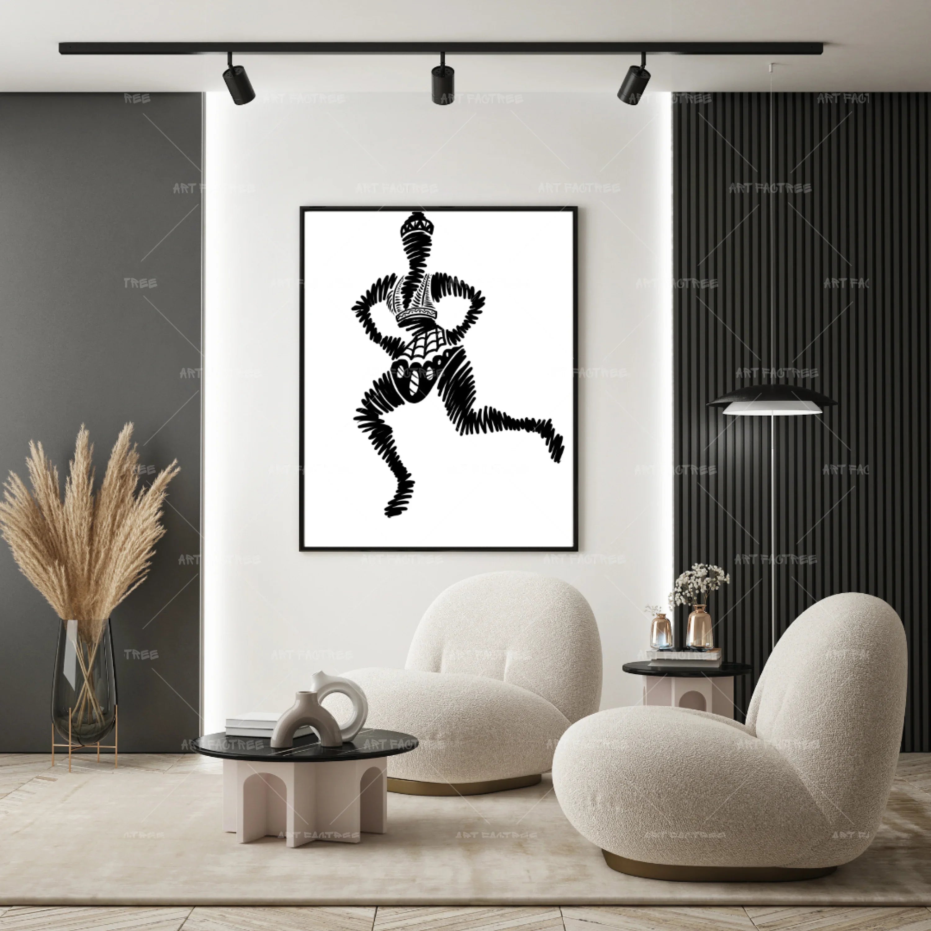
- Dark artwork on light walls
- Deep tones paired with soft neutrals
- Bold accents within subtle compositions
Contrast doesn’t need to be extreme—it just needs to create separation between elements.
3. Introduce One or Two Accent Colors
A neutral room benefits from subtle pops of color.
Instead of overwhelming the space, choose artwork that includes one or two accent colors.
These accents can be repeated in:
- Throw pillows
- Rugs
- Decorative accessories
This creates a cohesive and intentional design.
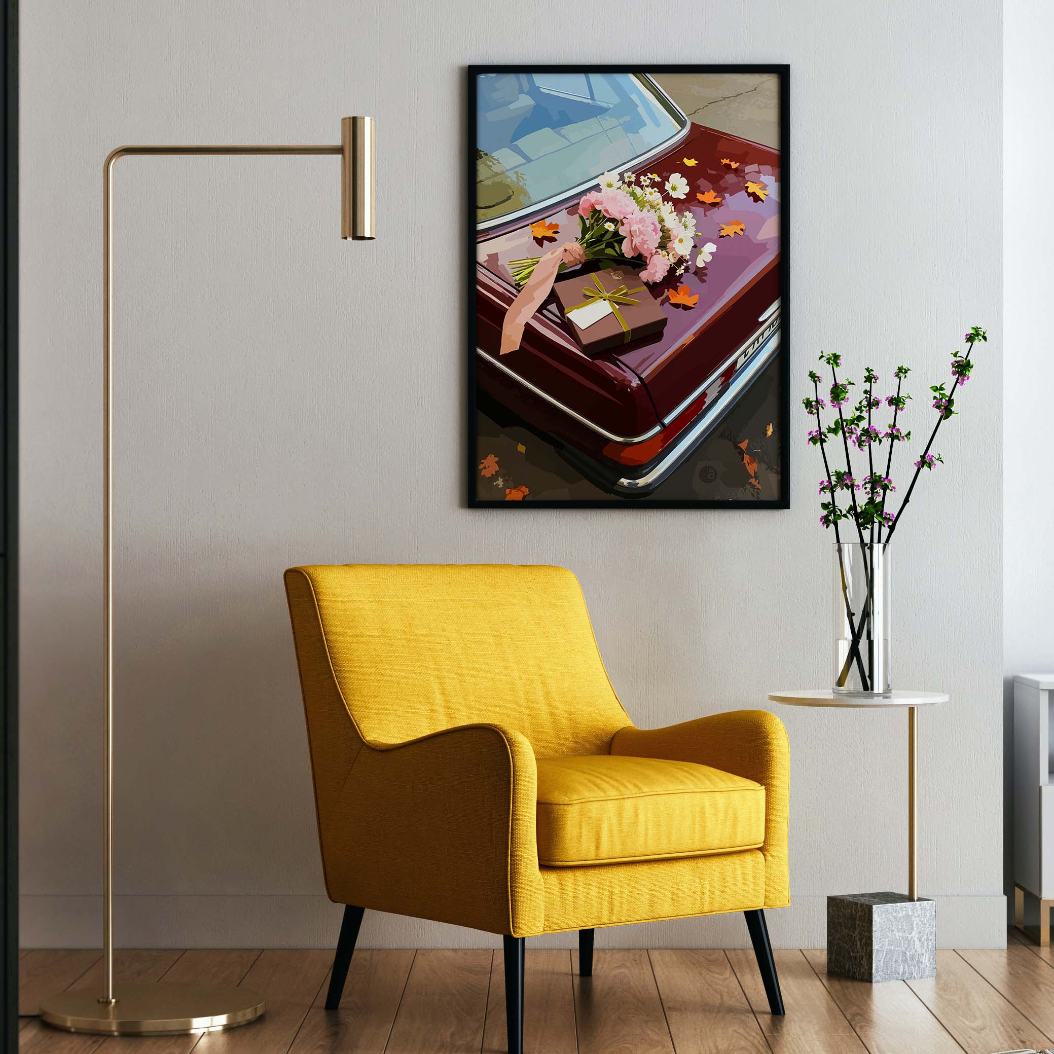
4. Use Earth Tones for Warmth
Earth tones are a natural extension of neutral palettes.
Colors like:
- Terracotta
- Olive green
- Mustard
- Clay
- Warm brown
blend seamlessly into neutral interiors while adding warmth.
These tones are especially effective in living rooms and bedrooms where a cozy atmosphere is desired.
5. Choose Black as a Grounding Element
Black is one of the most powerful colors you can introduce into a neutral space.
It provides:
- Strong contrast
- Visual grounding
- A modern, sophisticated feel
Black elements in wall art help anchor the room and prevent it from feeling too soft or undefined.
Black-and-white artwork is particularly effective because it balances contrast with simplicity.
6. Use Soft Color Gradients for Subtle Depth
If you prefer a more understated approach, choose artwork with soft color transitions or gradients.
These pieces:
- Add visual interest without overwhelming the space
- Maintain the calm nature of neutral interiors
- Create a layered, sophisticated look
This approach works well in minimalist homes.

7. Consider Monochromatic Art for Simplicity
Monochromatic artwork uses variations of a single color.
This style works beautifully in neutral spaces because it:
- Maintains consistency
- Adds subtle variation
- Avoids visual clutter
For example, shades of grey or beige within one artwork can create depth without introducing new colors.
8. Reflect Existing Colors in the Room
One of the easiest ways to ensure your wall art complements the space is to reflect colors already present in the room.
Look at:
- Furniture tones
- Wood finishes
- Fabrics and textiles
- Decorative accents
Choosing artwork that includes these colors creates a natural connection between elements.
9. Avoid Overly Bright or Clashing Colors
While bold colors can be effective, they should be used carefully in neutral interiors.
Overly bright or clashing tones can:
- Disrupt the calm atmosphere
- Feel disconnected from the rest of the room
- Overpower the space
Instead, opt for muted or balanced versions of bold colors.
10. Balance Warm and Cool Elements
A well-designed neutral space often includes a mix of warm and cool tones.
Wall art can help achieve this balance.
For example:
- Add warm tones to a cool grey room
- Introduce cooler shades into a warm beige space
This creates a more dynamic and layered environment.
11. Use Artwork to Set the Room’s Mood
Color choice should align with how you want the room to feel.
- Calm spaces → soft neutrals, muted tones
- Energizing spaces → deeper contrasts, richer colors
- Cozy spaces → warm, earthy tones
Wall art becomes the emotional guide for the room.
12. Choose Timeless Color Combinations
Trends change, but timeless color combinations remain effective.
Examples include:
- Black and white
- Beige and brown
- Grey and soft blue
- Earth tones with neutrals
These combinations ensure your space stays relevant over time.
Smard Art’s curated pieces often focus on timeless palettes, making them long-term additions to your home.
Conclusion
Choosing wall art colors for neutral interiors is about balance—not excess.
By understanding undertones, introducing contrast, using accent colors, and maintaining harmony, you can enhance your space without disrupting its calm foundation.
Wall art should complement the room while adding depth, warmth, and personality.
When selected thoughtfully, wall art—like the carefully designed pieces from Smard Art—becomes the element that transforms neutral interiors from simple to complete.

Leave a comment
This site is protected by hCaptcha and the hCaptcha Privacy Policy and Terms of Service apply.